Each day I chat with a variety of business owners. Many of those are looking for a logo for their new venture. But more often than not, they don’t understand the range of formats they will need or know that a genuinely responsive logo will be the cornerstone of their brand.
A well-designed logo should be responsive to a variety of spatial needs. It’s been at least ten years since a one-size-fits-all solution was all that was needed.
The growth of the web and the varied number of devices and screen sizes has meant your logo needs to be responsive to all those requirements. What I generally see is a logo that is shrunk to fit the available space which then becomes unrecognisable.
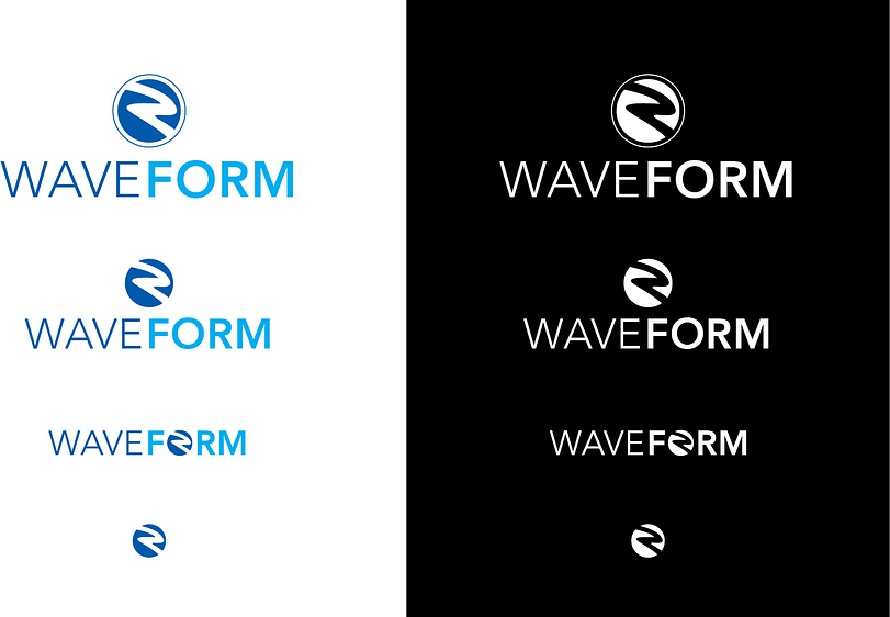
I was fortunate to work with a new client, WaveForm who didn’t have a rigid view of their brand and understood the need for a responsive logo. Having these solutions ready to roll out would increase their brand recognition no matter what the physical constraints.

As you can see above; WaveForm's full logo is vertically stacked and has a little bit of detail which could be lost when reduced in size. Giving them just one solution would not have met their needs for the future. A series of responsive solutions was supplied to ensure they had full flexibility. Those solutions included > full logo, less detail, horizontal and an icon that could be used as a gravatar.
If you haven’t already, I suggest you start considering refreshing your logo into a more modern, simplified version which is responsive to the demands of the web.
Share this blog with people that matter to you.
