I recently had a client make an emphatic request: ‘we don’t want old-fashioned fades in our presentation’. And I understand what they mean; for a while fades were über popular and could be found in every presentation and web page. Even Word documents started using a fade.
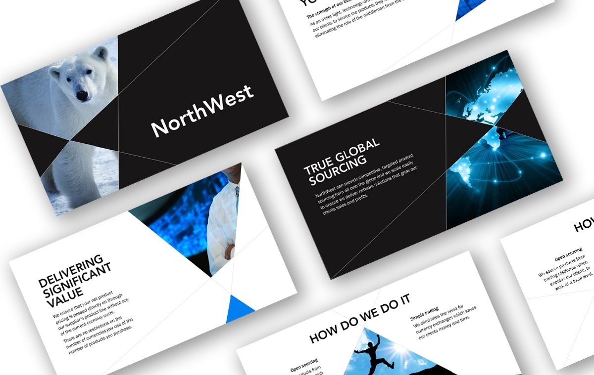
Then in what felt like a nano-second, we all switched to flat design. Solid colours and solid backgrounds reigned supreme.

Image above: A presentation we created with flat design.
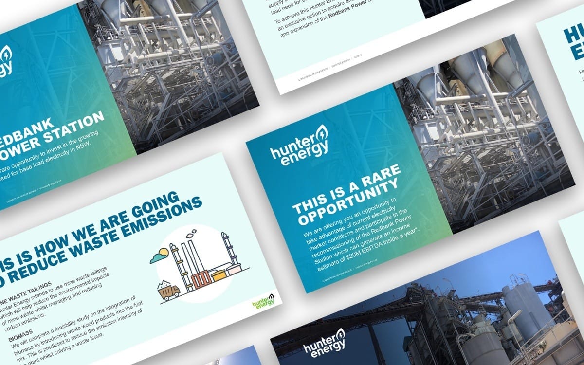
We are still in the middle of ‘a flat design phase’, however we are starting to see bold gradients being added to the mix. The contrast makes flat design pop and fits well with flat design’s modern, smooth appeal. No doubt you’ve already started seeing these kind of gradients being used on websites, in branding, illustrations and backgrounds.

Image above: A presentation we created using flat design and a bold gradient.
At AOK we’ve been having a lot of fun using gradients to create image colour overlays. We’ve also used it in branding and are looking forward to using flat design and gradient combinations on more projects.
It’s always hard to put a timeline on it; however if you wanted to stay up-to-date with design trends you couldn’t do better than watching how website design changes year-on-year. This is a medium that will always be in flux and will push us to rethink our design every few years to stay on-trend.
When was the last time you looked at your brand and thought ‘is our brand still relevant or could we do with a refresh’? Updating your brand guidelines every few years to reflect how trends are changing will ensure you are seen to be a leader in your market.
The fade is dead, long live bold gradients (for now anyway).
Share this blog with people that matter to you.
