Infographics are a brilliant visual tool for explaining complex information or data that would be much harder to understand in written form.
If you are considering an infographic for your message then I'll give you a quick heads up; there are three categories that infographics generally fall into:
Data Visualisation
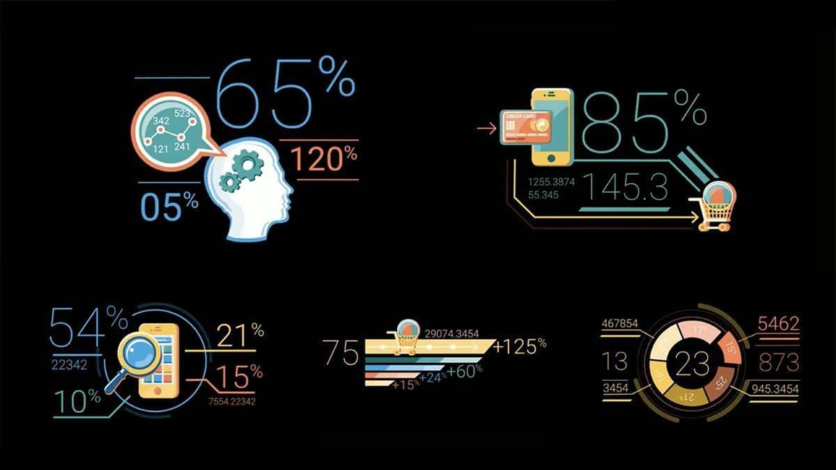
Data visualisation turns data into a picture or a graphic. They are very effective in communicating the meaning of raw data. A graph or a table would be an infographic in its simplest form.
Here are a few data visualisation samples...

Information Design
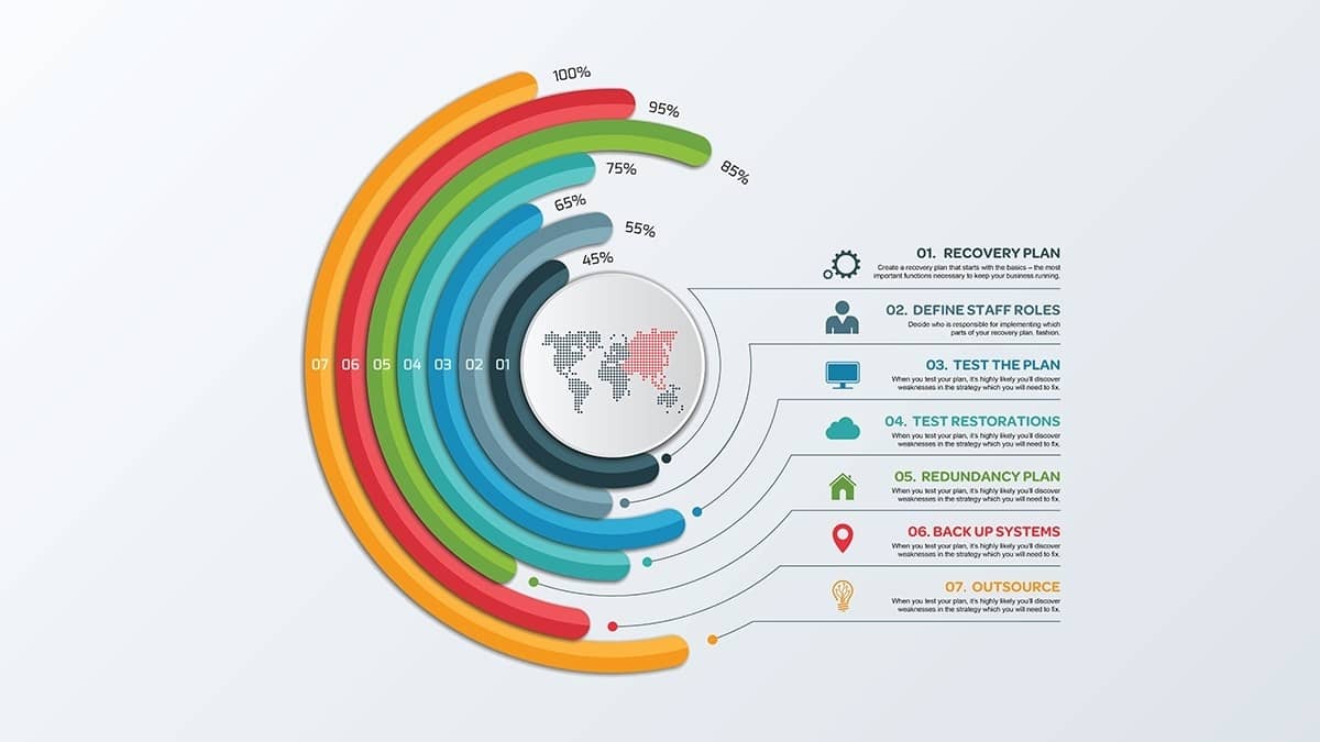
Numbers aren’t the only time infographics help simplify a story – another option is information design. These are brilliant when you are trying to explain a complex process so that people can make sense of it quickly.
Here is a sample so you can see what I mean…

Editorial Infographics
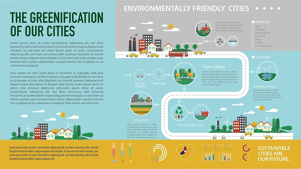
Then there are editorial infographics. They are rarely used in business but are a great option when you need to combine complex data, processes and chronology as a visual story.

Each type of infographic serves its own purpose and can be a powerful storytelling tool. In fact, infographics are reportedly 30 times more likely to be read than text and if done correctly, an infographic can be worth a thousand words.
Are you thinking about an infographic that would be useful for your business?
I suggest you get that infographic underway as it will be an excellent investment and can be used time and time again.
Share this blog with people that matter to you.
